Furr63 (the original)

this is the first logo I made for the site
(I had to check the file properties i couldn't really remember)
, simple enough

the animation of this one is honestly very cool, star are superior to wind tho

bubblegum vibes, I made this one while i was already using the next logo tho so i never used this one
Furr63 (the blocky)
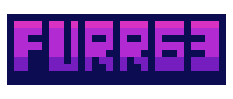
I wanted the logo to use less pixels, nowadays i think the first one was still better
Furr63 (the wiiiide)

now we're talkin! I did thought the lettering of the "furr63" was too fancy tho, but at the time i didn't had the skillz to pull of something cooler, but mah catchphrase is there!! truly epic

i wanted the logo to be less wide, i gave up on it pretty early
Furr63 (the current)

I proudly and confidently say: i cooked on this one, tho the color pallete was like this for accident because i accidentally deleted a color in the pallete while using aseprite indexed mode, but i thought it looked cooler like this. Then I added the PC in the middle was added to make the logo wider

I thought the logo wasn't animated enough so i added a bit of fire to the logo, but looking at it on the site it looked cluttered, so i got my trusty fire extinguisher™

The original colors!